
What kind of visual impact does your institution want to make?
Ink on paper can help capture a prospective student’s attention—and their loved ones’ —but there are many factors to consider when starting a print piece.
That’s why we’ve broken down our top aspects to keep in mind when designing a brochure for higher ed.
Photography & Logos
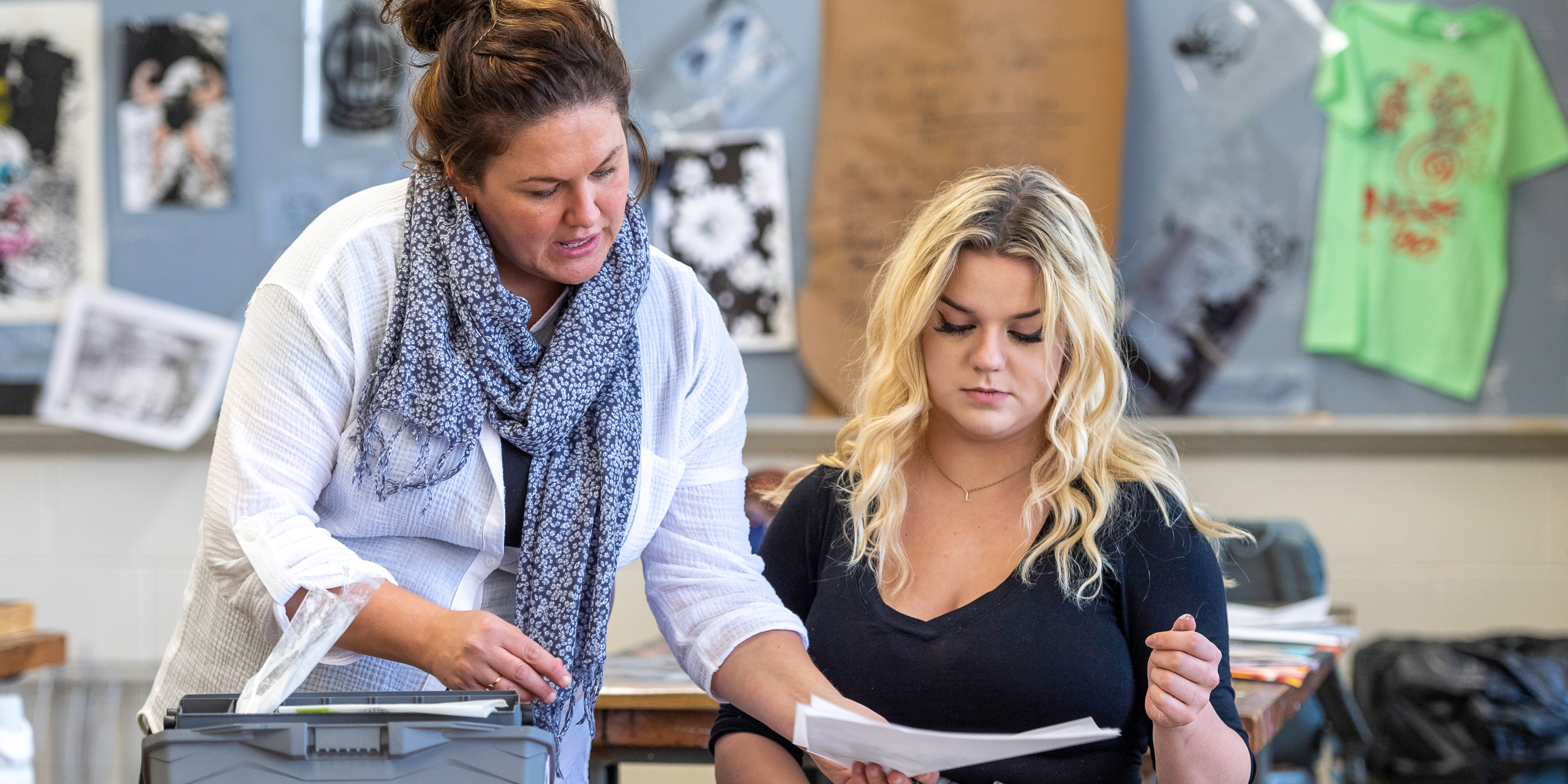
It should go without saying, but your cover photo should be strong and interesting enough to catch someone’s attention. Lively photos that speak to the content of the brochure work best, and make sure there is ample space within the photo for a headline and your logo.
However, you shouldn’t let your logo overpower the cover. Your school’s logo won’t do all the legwork of storytelling unless your school is a widely recognized brand. Eye-catching photography and dynamic copy will help show who your school is.
Keeping in mind readers likely skim brochures on their first read, you should ensure that your tagline and/or statement of the publication’s topic is clear. A student shouldn’t have to go beyond the cover to realize this is an academic brochure. This will also help them stay organized so they can quickly find the financial aid brochure if they need your institution’s FAFSA ID.
As much as we’d love to market who we want our college or university to be, you should always market what your institution is. That especially goes for photography.
It’s important to show your student demographics fairly. Otherwise, students will fall prey to false advertising. Diversity is crucial, but visually overstating your minority population to attract more minority students is not the way to do it.
Rather, we recommend creating pieces geared to those populations, like Spanish-language brochures for ELA students or a First-Gen brochure to help those students navigate application season.
Photos should also be contextual. If you’re creating a brochure for adult learners, it’s best to leave lanyard-wearing freshmen out of those pieces. Instead, we suggest photography that better represents that population.
Similarly, the STEM-section of your academic brochure could show a lab. Clubs and organizations could highlight a fun campus event. You get the gist.
It’s nice to establish a sense of place through your selected photography. After all, these brochures will help students visualize themselves at your school before they step foot on campus. Campus shots of buildings, athletic fields, and even greenery can help readers ‘build the world’ so to speak.
And if your campus isn’t the most visually appealing, there’s still a workaround. We find that vignettes are better than nothing.
Finally, don’t be afraid to switch up the photography for something graphic. We came across a unique publication done by Valparaiso University where the campus traditions were hand-sketched. Because of this different take, the piece felt thoughtful and authentic.
Formatting & Folds
This is where the devil’s in the details, and it pays to have an on-staff designer (or work with a marketing partner with lots of design experience) to make sure your pieces look professional and not thrown-together.
From the start, you should always keep the end configuration in mind. What size will this be? How many pages? How many blocks of content do you need to fill those pages?
This helps you not only put your ideas into an organized working draft, but it’s also crucial information that your copywriter needs so they don’t produce too little or too much copy for your intended final product.
It’s best to think logically when planning your brochure format. Sounds easy, we know. But it’s important to remember the basics.
For example, always consider content hierarchy. The order in which you present information should be easy to understand.
Let’s take it back to those essays we had to write as students. We present a topic, give information on that topic, then close it off with a so what. Brochures need to follow that same procedure.
We don’t want our so what, or in this case our call-to-action, to be randomly in the middle of the fold progression.
With that in mind, it’s important to consider bleed. For designer and print novices, this is the margin of space a designer leaves beyond the trim line.
Mass printing doesn’t come without the occasional accident—a piece sliding ever so slightly on the press could risk cutting beyond the intended trim line. And you don’t want an important part of your brochure to be accidentally cut off. Another reason why it’s best to avoid placing important info in the margins.
When you’re ideating pieces that can be a bit more playful and show personality (think acceptance packages or student life brochures), we highly recommend utilizing unique folds. These grab student’s attention as they don’t look like everything coming out of the mailbox. Plus, they’re not insanely expensive to pursue.
You can also use diecuts to shape the print piece into something related to your brand. Got a tiger as your mascot? Shape the piece into a tiger paw!
Consistency & Accessibility
The last thing we’ll touch on is crucial, especially in today’s marketplace.
Lay all your publications out on a table. Do they look like they’re from the same school? Are the headlines clear? Are all the links easy to distinguish? If you’re using stylized bullet points, are there any lingering bullet points to be changed? Are the quotes formatted the same?
Not everyone will catch these tiny details, but this helps readers establish a general rule of thumb when viewing your piece.
For accessibility purposes, make sure you use legible fonts that aren’t too big and aren’t too small. Yes, some stylized fonts are striking, but if that impacts legibility, it’s best to nix it.
Having solid color contrasts can help visually impaired readers digest your content. And it doesn’t have to be a guessing game.
Printed materials use CMYK color models. Most online tools don’t directly support CMYK, so you’ll need to convert your print colors to their closest HEX equivalent in order to check for contrast.
Actual print results can vary depending on the type of paper, ink, and printer calibration. That’s why we preach the importance of test printing samples so you can evaluate contrast for key elements, like text over background colors!
You should also always include the url a QR code will lead someone to. Not only should the reader know where they’re being asked to go, but this avoids excluding someone with mobile impairments.
Creating High-Impact Brochures with The Parish Group
If your institution could use a refresh on their publication suite or wishes to expand it out, The Parish Group is ready to help.
We have 38 years of publication experience under our belt and have won multiple awards for our recent work. We take the time to learn your institution inside and out before creating a look and feel that reads as authentic and dynamic.
Reach out at success@parishgroup.com or call us at 828.505.3000 to learn more.
Together, we do BIG things.