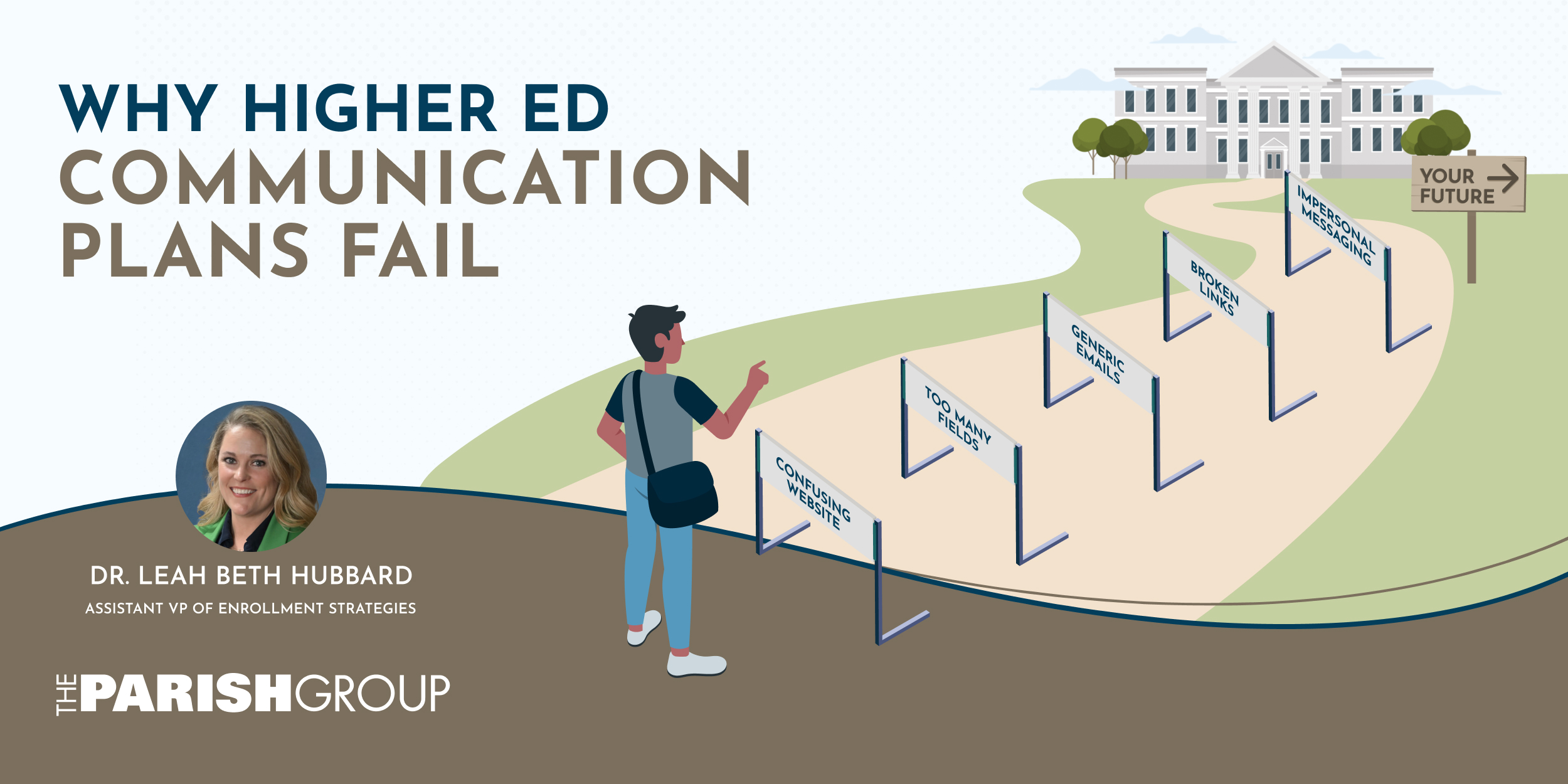
Over the past few months, I’ve been entrenched in communication plans for all sorts of institutions.
As part of my transition into consulting at The Parish Group, I’ve had the opportunity to dive into how colleges and universities communicate with prospective students. I’ve learned a lot about schools I didn’t know about, and had plenty of preconceived ideas stomped on by schools I thought I knew.
And while every institution has its own personality, there are consistent issues that keep surfacing—not because enrollment and/or marketing teams aren’t working hard, but because communication planning is incredibly complex. Most teams are balancing limited time, limited staff, competing priorities, and thousands of prospective students, all while trying to create a personalized experience.
After reviewing communication plans across a variety of institutions, I’ve found myself making many of the same observations and wanted to share what I’ve been documenting.
The big takeaway: communication plans rarely fail due to a single catastrophic mistake. They fail because of many small moments that chip away at the excitement a student (and customer…) journey should build.
The good news? Small moments usually mean easier fixes.
The Patterns I Keep Seeing
Your Website Should Be a “Help Me” Page, Not Just a “Look at Us” Page
One of the most common patterns I’ve noticed is that institutional websites often seem positioned for a hard sell. They tout their achievements and accolades, and often seem primarily positioned for donors or athletics, rather than marketing pathways that have the information prospective students are trying to find.
Look, I get that websites typically serve more than one purpose, and that they serve alums, donors, and current students as well as prospective ones, but when it’s all about your rankings or institutional history, you might be boring prospective students before they even begin. And you can definitely answer the practical questions prospective students might have—How do I apply? Can I afford this? Who do I contact? What happens next?—while serving your other audiences.
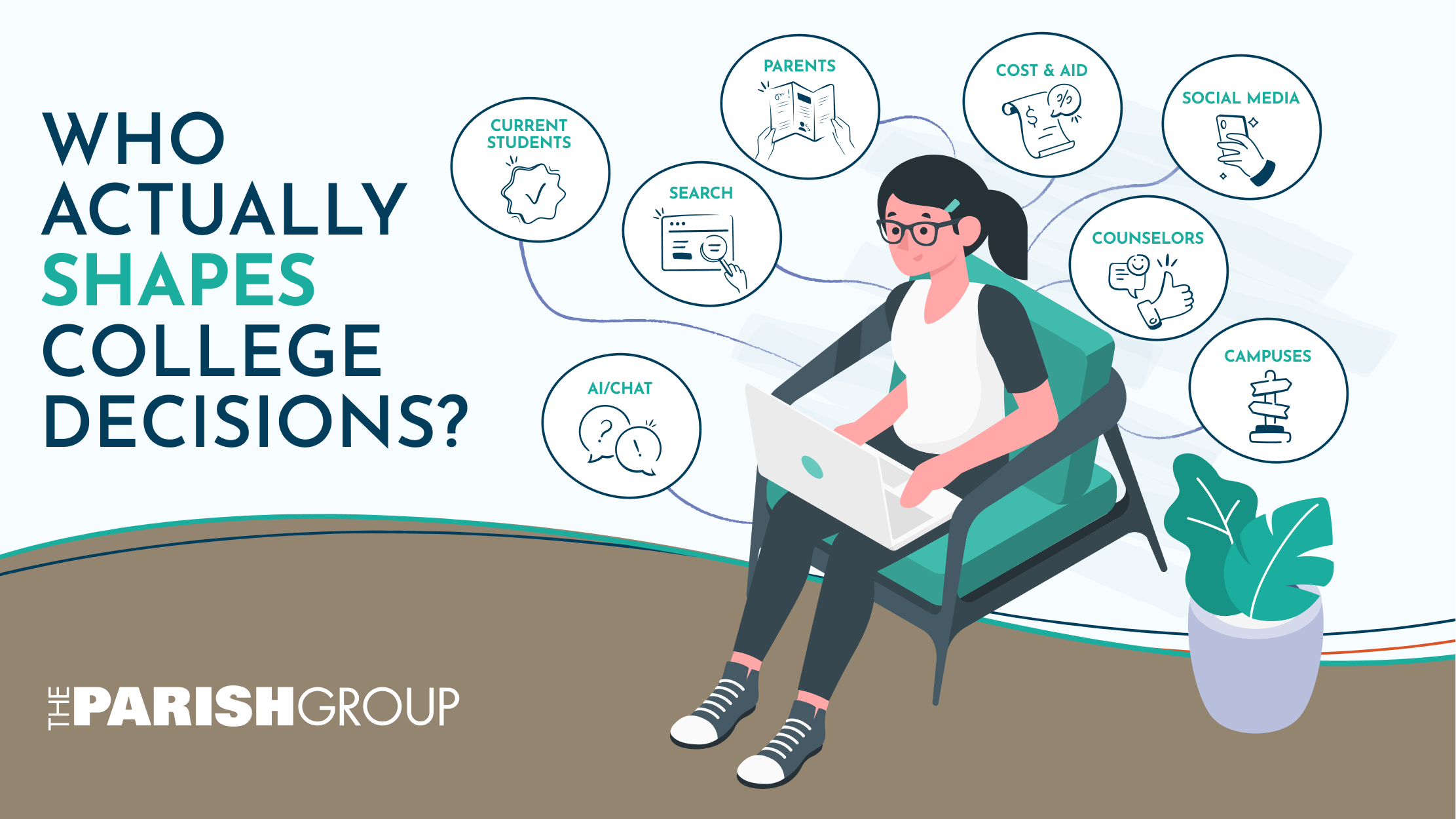
When those answers are difficult to find, students don’t stop searching. They simply search elsewhere, often on social media, Reddit, or through AI-powered search tools, where you have much less control over the narrative.
A great institutional website prioritizes marketing the institution to prospective students, empowering them to confidently take the necessary steps to determine whether they’re a good fit and apply for enrollment. If your website is prioritizing the other things, even if it does it well, it’s not doing its number one job.
Every Form Creates Friction
Request for Information forms seem simple enough, but they’re often among the first places where prospective students experience unnecessary friction.
I’ve seen forms that are difficult to find, ask students for information they don’t yet have, or never explain why completing the form is worthwhile. I’ve also seen vendor landing pages that don’t connect smoothly back to the institution’s website, creating a disjointed experience before the relationship has even begun.
Every additional field, every extra click, and every point of confusion creates another opportunity for students to leave (the average abandonment rate for online forms is a whopping 67%).
When making forms, ask yourself: Does every question serve a purpose? And does the value of completing the form feel obvious to the student?
Your Emails Should Feel Like an Invitation
Another pattern I see regularly is communication written from the institution’s perspective instead of the student’s. If you’re communicating with prospective students, you’re often writing to 15-, 16-, and 17-year-olds. Your first email shouldn’t read like the introduction to a dissertation, nor should it assume they’re obsessed with Princeton Review rankings. It should meet them where they’re at by showcasing the value of not just higher education but your institution’s unique spin on it.
You also need to remember that prospective students are prospective customers, and treat them as such. You need to get their attention and nurture them through your enrollment (sales) cycle. I mention this because, for whatever reason in higher education, we like to pretend these aren’t customers, and when we do, we lose sight of standard best marketing practices.
I’ve seen too many first-touch emails that try to explain everything at once—the institution’s history, admissions process, financial aid, campus visits, academic offerings, and more. That’s a lot to ask of someone who’s just beginning to get to know you (it’s worth noting that emails with a single clear CTA get 35-42% more replies than those with multiple).
Think about what you’d say if a prospective student walked into your office for the first time. You probably wouldn’t launch into a ten-minute monologue. And you wouldn’t start bragging to them about all your achievements. You’d welcome them, get to know who they are and what makes them tick, answer their first question, and help them understand what comes next. Your emails should do the same.
The most effective enrollment communications aren’t the ones with the most information or hardest-touted accomplishments. They’re the ones that make students feel welcomed, guided, and confident about taking the next step.
Personalization Is More Than a First Name
Most institutions have embraced personalization in some form. In fact, with Gen Z students—and soon Generation Alpha—it’s become an expectation, not a nice-to-have.
But too often, personalization begins and ends with inserting a student’s first name into an email. Meanwhile, prospective nursing students receive the same messaging as business majors. In-state students receive the same communication as students applying from out of state. Students interested in scheduling a visit receive the same emails as those who haven’t engaged at all.
Students are asking us to treat them like individuals, which entails understanding their unique needs (Salesforce’s The State of the Connected Customer found that 76% of customers expect companies to understand their needs and expectations). If our communication doesn’t reflect who they are or where they are in their enrollment journey, they’ll notice (especially because so many of the brands they are interacting with daily are doing this).
Timing Needs to Be Strategic
One of the more subtle patterns I’ve noticed has nothing to do with the content of the communication—it’s the timing.
I’ve seen institutions send three different emails within two days, each with a different message or call to action. Then…nothing for a week. Other times, students receive similar emails on back-to-back days, followed by long stretches of silence. And then there are institutions that send out multiple deadlines!
From the institution’s perspective, each communication probably makes perfect sense. Different departments are sending different messages, often for different reasons. But from the student’s perspective, it’s one experience.
Communication plans shouldn’t just focus on what to say—they should also consider when to say it. A thoughtful cadence helps students feel guided through the process instead of overwhelmed one week and forgotten the next.
Details Build Trust
If there’s one theme running through everything I’ve shared here, it’s this: details matter!
None of the examples we’ve talked about are massive strategic failures. They’re the small moments that are easy to overlook because, on their own, they don’t seem particularly significant. But these little details—an impersonal email, an overwrought form, a generic website—not only add up but, on their own, are enough to lose the attention of today’s prospective students (a population that has more content competing for their attention than ever before).
When I first started in admissions, a colleague of mine had a phrase she’d repeat whenever we were reviewing communications: “Details, details, details.” At the time, she was usually talking about proofreading or checking a date before hitting send. Years later, after reviewing communication plans from institutions across the country, I’ve come to realize she meant something much bigger.
The details aren’t just about avoiding mistakes. They’re about creating an experience that feels thoughtful, intentional, and student-centered. Every small improvement—whether it’s simplifying a form, rewriting an email, fixing a broken link, or making your website easier to navigate—helps build trust.
Looking at Your Communications with Fresh Eyes
Again, if there’s one thing these observations have reinforced for me, it’s that communication plans rarely fail due to a single major strategic decision.
The challenge is that when you’ve been working on the same communication plan for months—or even years—those moments become difficult to see. You’re simply too close to them (or, simply repeating what you did last year, because of a lack of bandwidth to do a full rewrite based on what data’s shown).
Sometimes that means asking current students to walk through your communications and tell you where they get confused. Sometimes it’s a colleague from another department who isn’t as close to the work. And sometimes, it means bringing in someone from the outside who can evaluate the experience without assumptions or institutional blind spots.
No matter who provides that perspective, the goal is the same: to experience your communications as a prospective student would.
Because communication plans don’t exist to move students through a funnel.
They exist to help students feel informed, supported, and confident enough to take the next step.
Wondering how your communication plan stacks up? I work with colleges and universities to identify opportunities, reduce friction, and create communications that better support prospective students throughout the enrollment journey. Let’s chat!